
.svg)

Brand Design / Studio journal
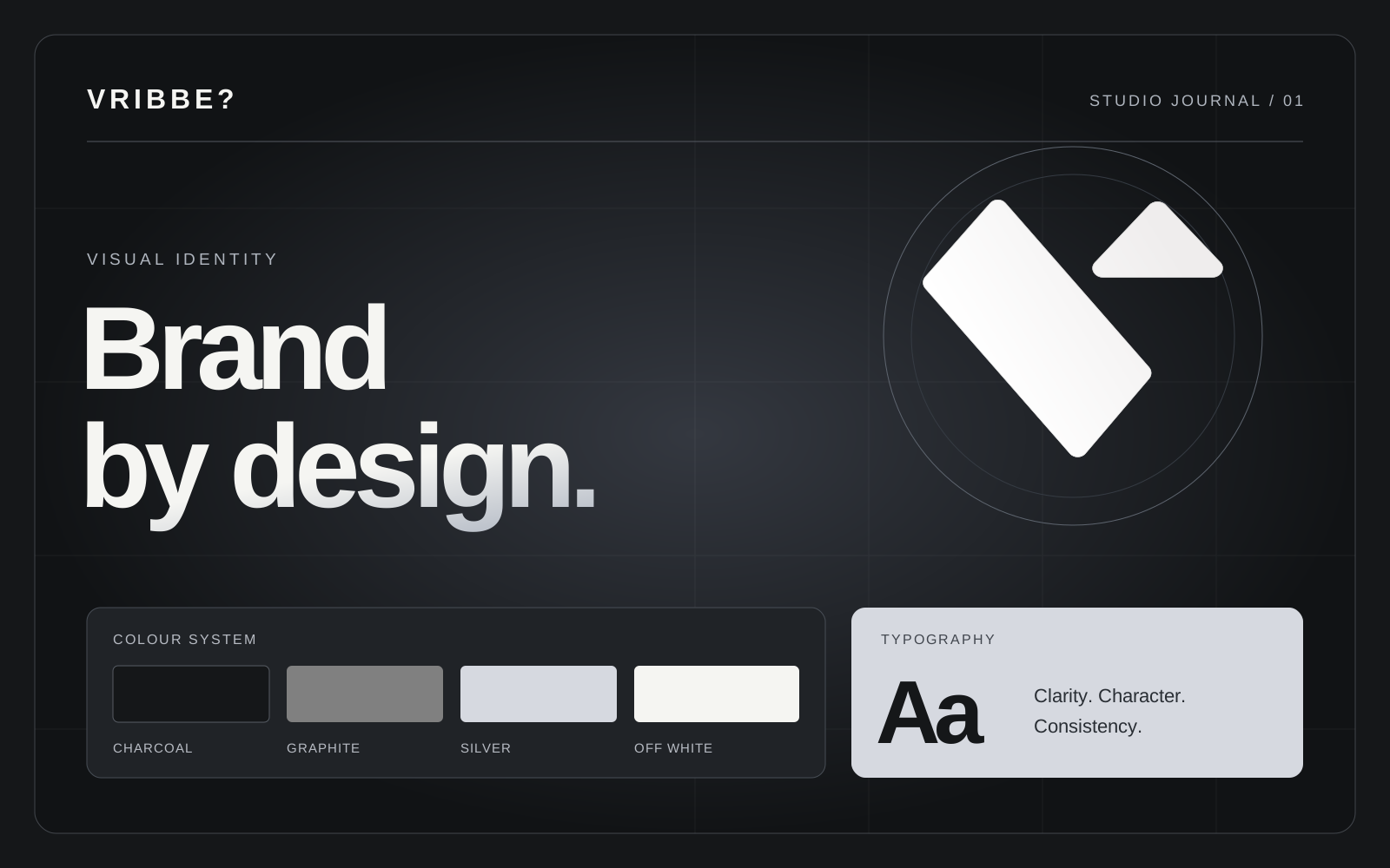
How colour and typography shape your brand
Start with your purpose
Before choosing colours or fonts, define your audience and the impression you want to leave. A confident, approachable or precise brand calls for different visual decisions. A short set of brand principles gives those decisions a shared direction.
Give every colour a role
Use a primary colour for recognition, neutral tones for comfortable reading and an accent for important actions. When everything demands attention, priorities become unclear. Check text contrast on both light and dark surfaces.
Build a clear reading hierarchy
Establish distinct styles for headings, body text and supporting information. Choose fonts that support every language your site uses. On mobile, test type size, line length and spacing together using real content.
Test the identity in context
Try the system on a mobile page, a social post and a contact form, as well as your logo. Document the colour and typography rules in a small style guide so future work feels consistent.